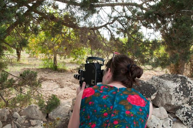
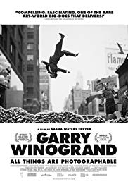
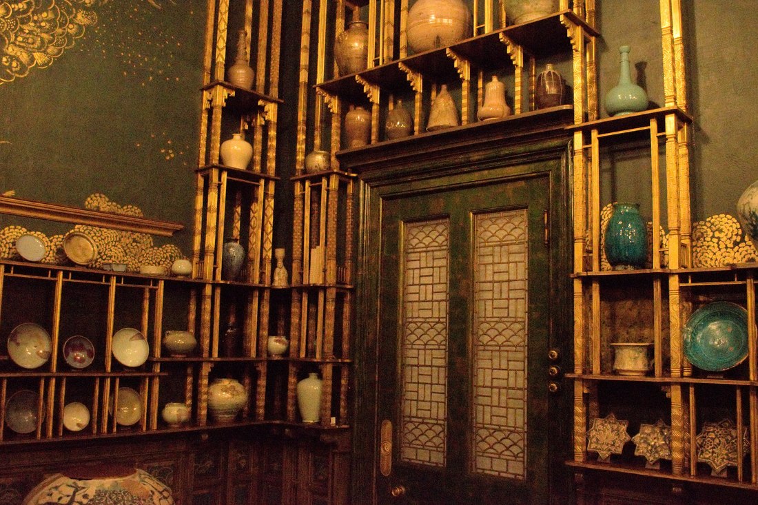
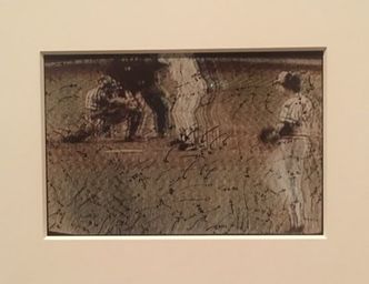
Reflection Sasha Waters Freyer (above left), teacher and filmmaker, delivered an excellent lunchtime lecture on film and following ones artistic instincts. The medium of film is uncharted territory for me, so all the information she gave was new and enticing. It was interesting to learn about her process and how it differs from film to film. Her experimental pieces are more personal and spontaneous. We had the opportunity to watch one of her videos and I was intrigued although slightly confused, but I am fairly certain that this was her intention. She provokes us to take a deeper look into everyday things by compiling and layering her own work with archived footage. Her long term films are documentaries and she has recently completed one on Garry Winogrand (above right). These documentaries require extensive organization, funds, and support. She is thorough and spends around five years for each project and I have a newfound appreciation for all those able to produce such films. Though film is not my media of focus, much of the advice she gave relates to all art. She intertwines long term endeavors with short films similarly to our class’ projects and play pages. She also integrates her knowledge of photography, the field in which she received her degree, into her film teaching and creation. It assures me to know that no matter what path I choose to follow, what I learn can funnel into my work later in life and assist me to become a more well rounded person. Resources
In my search to understand more about experimental film, I found this helpful resource explaining terminology and genres within the category of experimental film. http://independent-magazine.org/2013/03/minhae-shim_defines_experimental-film_avant-garde_video-installation/ Here is a website which has compiled a collection of avant garde short films. Feel free to sift through the list and find something that speaks to you. The meaning of this art seems highly dependent on the viewer and what is effective is very subjective. I am personally out of my comfort zone as I dive into the sources and while I did find some interesting pieces it is up to you to decide what holds meaning for you. http://dimthehouselights.com/2016/03/10-great-experimental-short-films-you-can-watch-right-now/
2 Comments
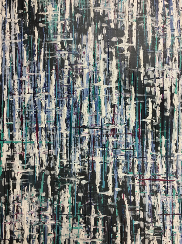
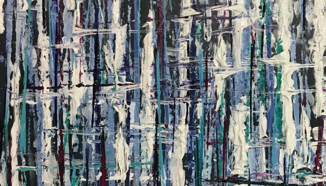
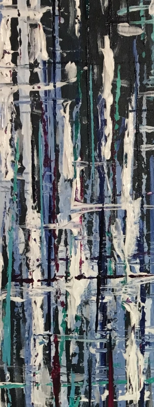
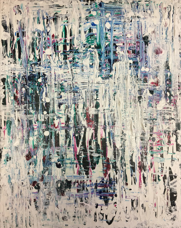
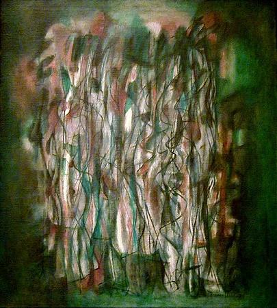
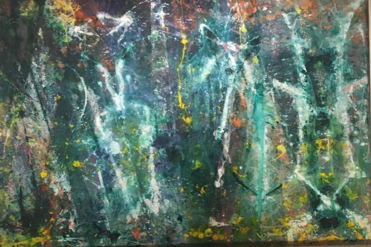
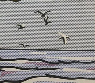
The painting to the left is my final piece and the painting to the right is my practice piece. In my opinion, they share the same general feeling, though the final piece seems more controlled while the practice was more sporadic. I do like the spontaneity of the first piece, but the practice allowed me to plan for the next piece. I like how in the final piece, I preserved more of the dark under-layer and utilized different textures.
My favorite parts of this piece are when you can see all the different layers of paint built up over time and scratched together. It gives the illusion of depth and layers of trees which alludes to my title: Birch Trees.
2/15/19
At this point, I'm doing more of the same thing and adding finishing touches. I added a bit more bright blues and white. Next time I want to paint the edges and sign it, but other than that, I believe it is done. 2/13/19 I added a bunch more white lines to give the piece more depth and begin closing the bigger black gaps. I also took dark values of my color palette to add detail into the remaining dark space. 2/11/19 Mrs. Mosley gave me a giant bin of string so I dipped different sizes in paint and printed and dragged them onto the canvas. This allowed me to get thin and straight lines across a wide area. I also used the palette knife to create the textured white lines. It was looking a little too vertical so i scraped horizontal lines into the paint already on the canvas. 2/6/19 Just getting started! I painted down a dark base and was going to leave it there but I also added some white marks that I could build on top of later that can peak through. I know I want to bounce off of my practice painting by creating a pattern of vertical lines but I haven't decided what method I should use yet. 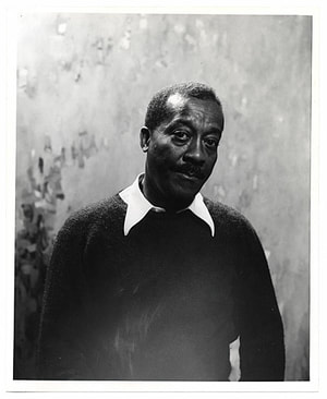 Biography Born in Harlem in 1909, Norman Lewis was acutely aware of the racial inequality which surrounded him from a young age. He knew at just ten years old that he wanted to express himself and his feelings through art. He studied art in high school and briefly worked as a seaman before returning to New York to expand his knowledge of art. He learned from artist Augusta Savage and attended Columbia University before going on to teach others at various high schools and colleges about the world of art. As he taught others, he learned more about his personal voice and consequently his art constantly evolved and changed.
Check out these sources for more information and to help answer the questions This source has a good selection of pictures and captions to answer question #1 https://www.swanngalleries.com/norman-lewis This link goes into more detail about Lewis' life for questions 2 and 3 but feel free to skim http://www.spaniermanmodern.com/artists/norman-lewis Questions
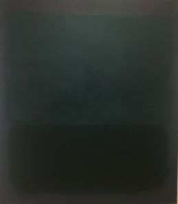
1. Choose one of the paintings shown in the first source provided to which you are most drawn. Why did you choose this piece? What techniques or principals make this work effective? 2. How did the artwork of Norman Lewis change over time? 3. How did Norman Lewis’ awareness to the injustices against African Americans affect his work and interactions in the art community? Reflection: Abstract Expressionism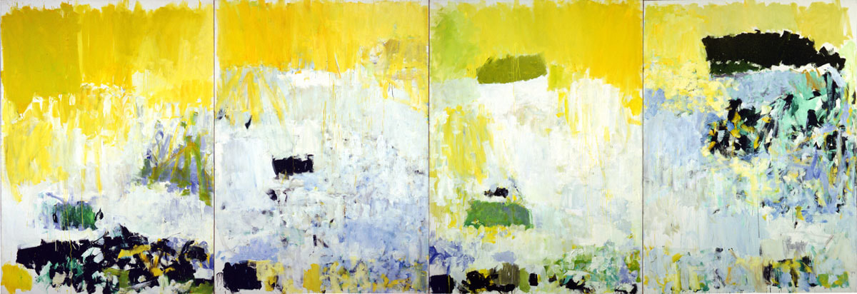 Joan Mitchell, Salut Tom, 1979, oil on canvas, National Gallery of Art
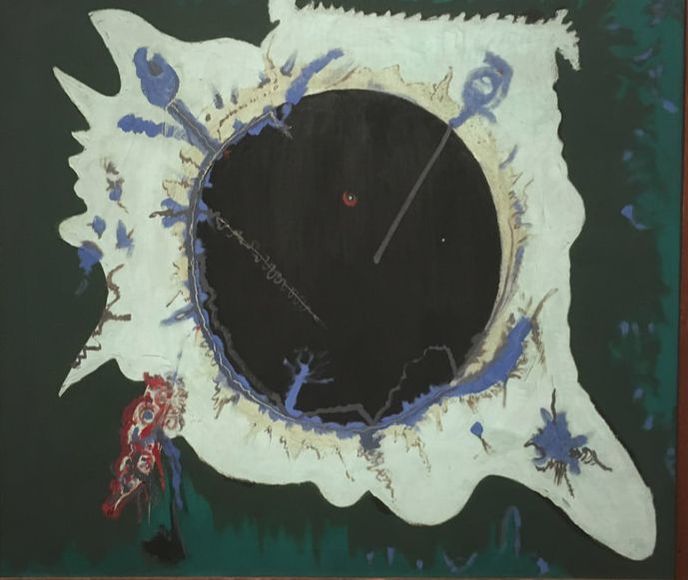
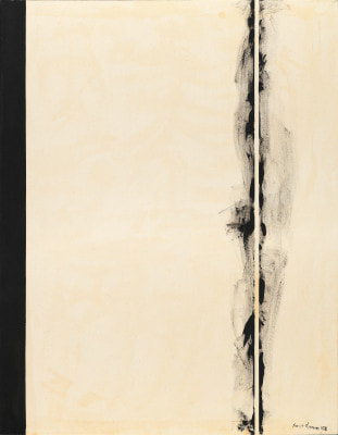
Salut Tom by Joan Mitchell The broad, confident brush strokes which are a staple of many Abstract Expressionist pieces are what first draw me into this piece. Also, the way the strokes stop before the edge of the paper is unexpected and gives a rough finish to the painting. She uses a palette of blues and yellows showing ability to choose an effect combination of colors. The colors of the piece produce an overall beach like feeling which is very soothing and positive. Similarly, I may choose those colors for my own abstract painting. I am also intrigued by the discontinuity between the four different panels. The paint does not connect smoothly from one to the next and rather jumps across each canvas. It makes me wonder if she painted the panels completely separately or if she referred to each of them as she painted. Pagan Void by Barnett Newman This piece is a bit smaller and more condensed than the other Abstract Expressionist paintings. The squiggles and shapes still have a feeling of spontaneity, but the brushstrokes are smaller and appear to be more careful. The amorphous shapes fit right into the abstract style. Additionally, I like how he uses shadow in order to make it seem like the two dimensional shapes pop off the page and I think that could be an interesting addition to my abstract painting. After reading the title, I realized there was a deeper meaning behind this piece and wondered if that small red dot in the large black expanse could be a commentary on religion. What point was he trying to make? Newman highlighted the importance of an engaging title which allows the viewer to think more deeply. First Station by Barnett Newman Now you may be thinking, of all the Abstract Expressionists, why did I choose two works by the same guy? Well, I didn't plan it that way, I realized they were the same artist after I began the second one, so I just kept with it. This brings me to my next thought which is that Newman changed his style between these two works so much that I did not know they were both by him. What motivated him to paint in such a range of styles? This piece uses contrast between light and dark just like the the other paintings, except this time it is with black and white. I quite like the stark contrast between the two opposites and the use of a slightly warm white. It is also fascinating how he juxtaposes clean, controlled lines with feathered edges of quick brush strokes. Reflection: Play Page Inspiration
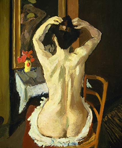
La Coiffure by Henri Matisse
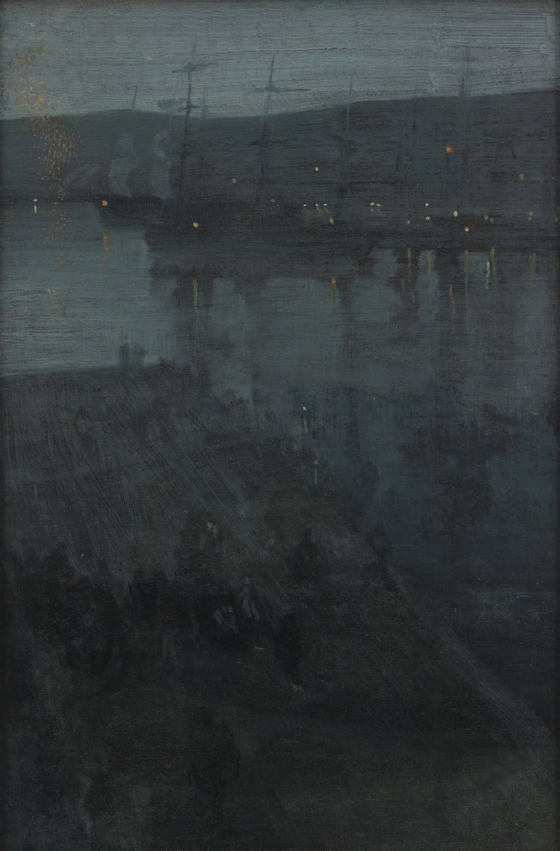
The way Matisse captures the fluidity of the figure's movement with visible and confident brush stokes is captivating. Furthermore, he places the figure the center to make it the focus and he adds interest to the composition by allowing you to see the woman's reflection blurred in the mirror. He elegantly uses light and dark in order to create contrast between the figure and her background. I would like to gain the confidence to create such bold value choices. This work relates more closely to what I have done in recent play pages since I have been reaching out of my comfort zone and focusing more on the figure. I have used a similar style and subject, but his is much more elegantly executed. In the future, I want to create a larger scale painting and I am really drawn to the impressionistic style, so perhaps I will chose to paint a figure in a candid pose such as this one. Nocturne in Blue and Gold by James McNeil Whistler After completing an artist spotlight on Whistler, I was curious to see more of his work and I was once again intrigued by the dark blue and gray palette with blurred brushstrokes and speckled with pinpoints of light. The scene is dark and mysterious and makes you take a closer look. I was also interested to find out that this piece started out as a day scene but then Whistler painted over it to create a night image. This painting isn't closely related to what I've done in my past play pages. Though I have worked a little with paints and used dark backgrounds, it is nothing that similar to this. Instead, I was hoping this painting could inspire future works. I found a canvas in my family's hoard of art supplies and maybe I could apply similar techniques. 11/21/18
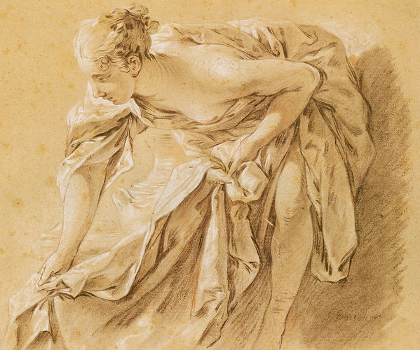
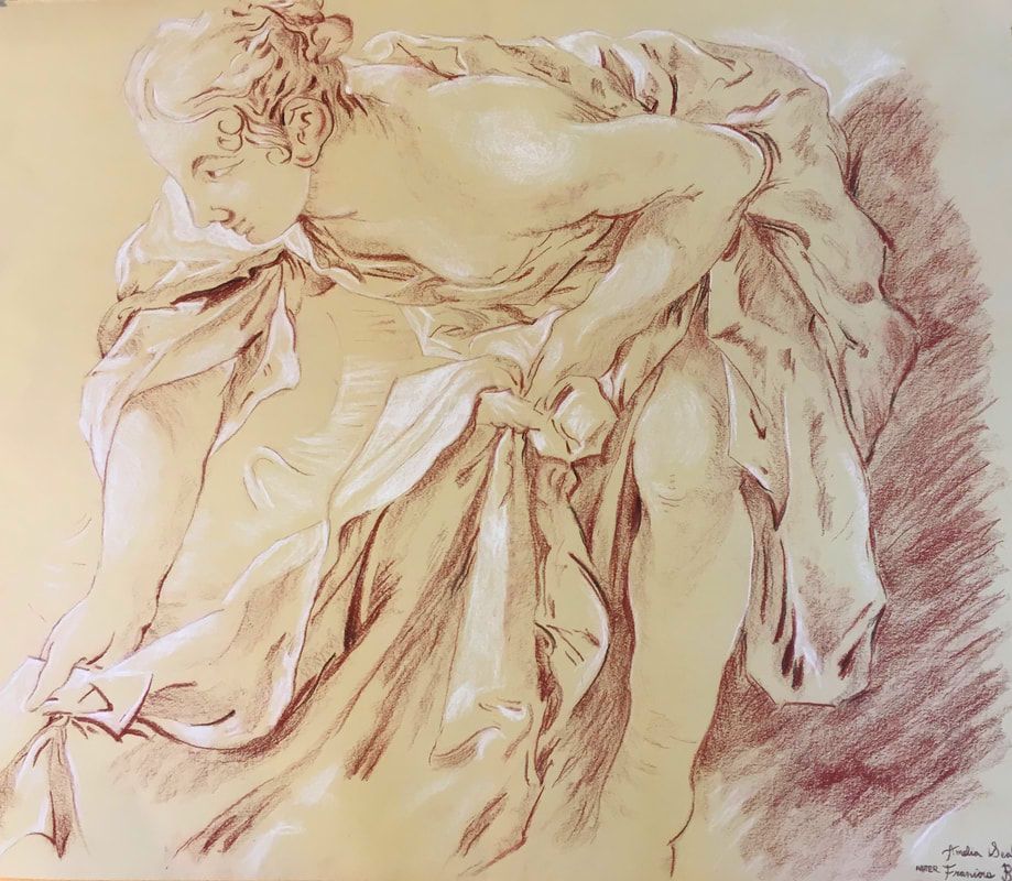
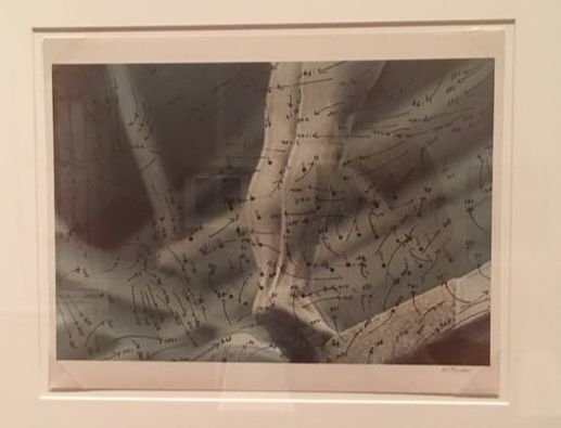
Sorry that there aren't more pictures but I basically did this over the course of a day with very long sittings and forgot to take pictures in between. I have realized that my hair is doing weird things so right now it follows the picture but that may be subject to change. I am also having some difficulty with the eye but I think once shadows are added, it will look more normal. Sandy is looking cute as ever, but I am still contemplating what mark I will use to make her fur. I thought I would have more difficulty with the hand than I did so I am pretty proud of that. I will continue to tweak the preliminary drawing after some critiques and I need to decide how to move forward with the background. Additionally, the composition could change and part of it i need to deckle at school. 11/26/18 I am off to a hesitant start with the conte and kind of skipped around between different parts of the piece. Hopefully I will get into a rhythm soon. 12/1/18 I did the folds of the shirt and I am pretty happy with how they turned out. I think the fabric makes it more similar to the old master drawing but the marks overall look a little bit smudgier and darker that the old master drawing. 12/2/18 I did a bunch today and added conte to the puppy and the face. I had some issues with the fur folds around Sandy's neck, but I think I fixed it and it looks pretty good now 12/6/18 I spent a while just focusing on the face and she went through a bunch of nose jobs before it looked remotely like me but I think the shadows on the face helped bring it together. 12/7/18 Here, I added in the white highlights which is always so fun and makes everything pop more. I had been avoiding the hair up until now but I started on it and right now it looks like I am graying. 12/8/18 I finished the hair and tried my best to capture all of the fly aways and shadows without my hair looking like a bird's nest. It is a little different approach that the old master but since it was closer up, I think more detail was needed. 12/9/18 I have two pictures for this because I realized I did the background but forgot to add highlights to the fabric. I am still a little torn about the background but I don't want to add too much and detract attention from the subjects. Then I signed it and now all I have to do is deckle the last edge. 12/11/18 After a helpful critique, I have enhanced the highlights, and darkened the background so now I think I'm actually done. 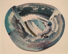 Untitled (Peace) c. 1980 acrylic and paper collage courtesy of Garth Greenan Gallery, New York Untitled (Peace) c. 1980 acrylic and paper collage courtesy of Garth Greenan Gallery, New York REFLECTION Howardena Pindell: Pindell's gallery was stunning and rich with emotion and expression. She explored a variety of mediums in order to expose the viewer to her personal experiences as well as political issues. She uses pattern along with words in order to bring to light topics of war, apartheid, poverty, and racism. She advocates for peace and tranquility which starkly contrasts the violence and hatred of the world around us. The piece to the left compares the ebb and flow of water to a peaceful earth. Pendell utilizes various Artist Habits of Mind as well as Artistic Processes in order to further refine her vision. When I look at her art, I specifically see her Developing Craft. Every work shows a step forward as she has a deeper understanding of how to manipulate hole punches, canvass, stitches, and paint. She also Expresses a lot since all of her work contains pieces of her beliefs and story. Within the artistic process, her inspiration from media and experience is evident as she cuts up pictures to show her piecing together life after a car accident. She also experiments with different compositions and techniques. However, she does not jump from one method to the next, but rather follows through with an idea to create an entire series. For example, in her Video Drawings series, she layered arrows and dots over blurred television images which exude moment and energy. I was immediately drawn to the combination of mathematics of physics and fluidity of art.
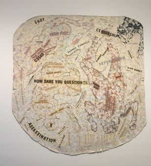 Autobiography: Air (CS560) 1988 acrylic, tempera, oil stick, blood, paper, polymer photo transfer, and vinyl on canvas Detroit Institute of Arts Autobiography: Air (CS560) 1988 acrylic, tempera, oil stick, blood, paper, polymer photo transfer, and vinyl on canvas Detroit Institute of Arts It was interesting to follow the growth of Pindell throughout the exhibit. As opposed to viewing variations of the same art piece over and over, there was exciting changes in technique while the fundamental style remained the same. The beginning of her journey focused mostly on her story, but she expanded her field of thought to include broader issues such as racism and linked global struggles to her personal struggles. The piece to the right uses thick paint to create amorphous figures and words to portray a political message. She also parted from just use of paint and experimented with unconventional and textured materials such as hole punches and glitter. This metamorphosis displays that humans are fluid and have the capability to develop and change. Her exhibit relates to what I am doing in my sketchbook in that she is developing her style through a variety of series. Albeit more professionally, this equates to the many Play pages we have made with a variety of themes. I aspire to reach her level of clarity in her voice and style and I hope that by filling my sketchbook with meaningful entries, I will be able to progress just as Pindell has. REFLECTION: 21st Century Art Abstract vs. Nonobjective
Mark-Making
use of art elements, design principles, and specific compositional choices
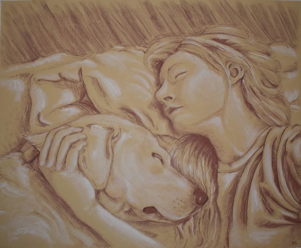
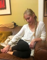
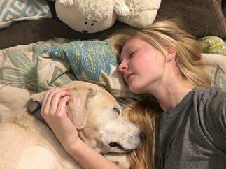
Being the indecisive person that I am, I have narrowed my options down to two pictures but I have yet to decide which to actually choose.
Edit: I have decided to draw the picture on the right mostly because my dog is adorable but also because with the other one I would have to make big changes in order to make the composition effective.
|
Hello Everyone!I am a Maggie Walker art student in Richmond, Virginia. This blog section is a little window into my art process, research, and experiences. You can follow along with my journey as you scroll. Archives
March 2020
Categories |


 RSS Feed
