|
11/21/18
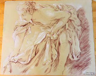
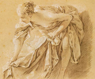
Sorry that there aren't more pictures but I basically did this over the course of a day with very long sittings and forgot to take pictures in between. I have realized that my hair is doing weird things so right now it follows the picture but that may be subject to change. I am also having some difficulty with the eye but I think once shadows are added, it will look more normal. Sandy is looking cute as ever, but I am still contemplating what mark I will use to make her fur. I thought I would have more difficulty with the hand than I did so I am pretty proud of that. I will continue to tweak the preliminary drawing after some critiques and I need to decide how to move forward with the background. Additionally, the composition could change and part of it i need to deckle at school. 11/26/18 I am off to a hesitant start with the conte and kind of skipped around between different parts of the piece. Hopefully I will get into a rhythm soon. 12/1/18 I did the folds of the shirt and I am pretty happy with how they turned out. I think the fabric makes it more similar to the old master drawing but the marks overall look a little bit smudgier and darker that the old master drawing. 12/2/18 I did a bunch today and added conte to the puppy and the face. I had some issues with the fur folds around Sandy's neck, but I think I fixed it and it looks pretty good now 12/6/18 I spent a while just focusing on the face and she went through a bunch of nose jobs before it looked remotely like me but I think the shadows on the face helped bring it together. 12/7/18 Here, I added in the white highlights which is always so fun and makes everything pop more. I had been avoiding the hair up until now but I started on it and right now it looks like I am graying. 12/8/18 I finished the hair and tried my best to capture all of the fly aways and shadows without my hair looking like a bird's nest. It is a little different approach that the old master but since it was closer up, I think more detail was needed. 12/9/18 I have two pictures for this because I realized I did the background but forgot to add highlights to the fabric. I am still a little torn about the background but I don't want to add too much and detract attention from the subjects. Then I signed it and now all I have to do is deckle the last edge. 12/11/18 After a helpful critique, I have enhanced the highlights, and darkened the background so now I think I'm actually done.
2 Comments
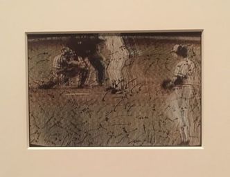
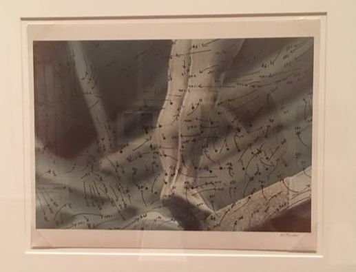
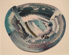 Untitled (Peace) c. 1980 acrylic and paper collage courtesy of Garth Greenan Gallery, New York Untitled (Peace) c. 1980 acrylic and paper collage courtesy of Garth Greenan Gallery, New York REFLECTION Howardena Pindell: Pindell's gallery was stunning and rich with emotion and expression. She explored a variety of mediums in order to expose the viewer to her personal experiences as well as political issues. She uses pattern along with words in order to bring to light topics of war, apartheid, poverty, and racism. She advocates for peace and tranquility which starkly contrasts the violence and hatred of the world around us. The piece to the left compares the ebb and flow of water to a peaceful earth. Pendell utilizes various Artist Habits of Mind as well as Artistic Processes in order to further refine her vision. When I look at her art, I specifically see her Developing Craft. Every work shows a step forward as she has a deeper understanding of how to manipulate hole punches, canvass, stitches, and paint. She also Expresses a lot since all of her work contains pieces of her beliefs and story. Within the artistic process, her inspiration from media and experience is evident as she cuts up pictures to show her piecing together life after a car accident. She also experiments with different compositions and techniques. However, she does not jump from one method to the next, but rather follows through with an idea to create an entire series. For example, in her Video Drawings series, she layered arrows and dots over blurred television images which exude moment and energy. I was immediately drawn to the combination of mathematics of physics and fluidity of art.
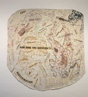 Autobiography: Air (CS560) 1988 acrylic, tempera, oil stick, blood, paper, polymer photo transfer, and vinyl on canvas Detroit Institute of Arts Autobiography: Air (CS560) 1988 acrylic, tempera, oil stick, blood, paper, polymer photo transfer, and vinyl on canvas Detroit Institute of Arts It was interesting to follow the growth of Pindell throughout the exhibit. As opposed to viewing variations of the same art piece over and over, there was exciting changes in technique while the fundamental style remained the same. The beginning of her journey focused mostly on her story, but she expanded her field of thought to include broader issues such as racism and linked global struggles to her personal struggles. The piece to the right uses thick paint to create amorphous figures and words to portray a political message. She also parted from just use of paint and experimented with unconventional and textured materials such as hole punches and glitter. This metamorphosis displays that humans are fluid and have the capability to develop and change. Her exhibit relates to what I am doing in my sketchbook in that she is developing her style through a variety of series. Albeit more professionally, this equates to the many Play pages we have made with a variety of themes. I aspire to reach her level of clarity in her voice and style and I hope that by filling my sketchbook with meaningful entries, I will be able to progress just as Pindell has. REFLECTION: 21st Century Art Abstract vs. Nonobjective
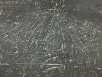
Mark-Making
use of art elements, design principles, and specific compositional choices
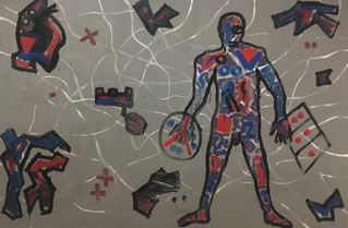
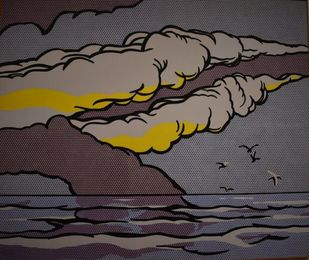
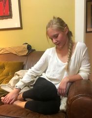
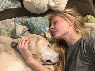
Being the indecisive person that I am, I have narrowed my options down to two pictures but I have yet to decide which to actually choose.
Edit: I have decided to draw the picture on the right mostly because my dog is adorable but also because with the other one I would have to make big changes in order to make the composition effective.
They aren't the highest quality but they are options
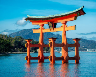 "floating" torii gate of Itsukushima Shrine "floating" torii gate of Itsukushima Shrine Reflection Amanda Dalla Villa Adams' lecture on Japanese Aesthetics was filled with intriguing insight into the origin, purpose, and implementation of Japanese Aesthetics. Much of the factual information given was previously covered in my global history or art class but she broadened my foundation with new concepts. She explained the simplicity and irregularity of wabi with the mystery and melancholy of sabi and applied them to aspects of Japanese life such as tea ceremonies and shrines. I was particularly drawn to the presented picture of the Grand Shrine of Ise and went on the discover other breathtakingly austere gates and shrines. To learn more about Shinto Architecture follow this link: doyouknowjapan.com/architecture/shrine/ Adam's focused much of her time discussing the Japanese writer, Tunizaki, and his book, In Praise of Shadows which highlights his adoration for the traditional Japanese customs. Among modernization and westernization, Tunizaki mourns the fossilization of tradition. Personally, I believe we should not condemn the progression of society as Tunizaki does, but instead allow both past and present to coexist in a balance. In any case, Tunizaki has the ability to vividly explain even the most mundane topics. As he describes the darkness of the interior of a lacquerware bowl combined with its soft exterior I feel as if i could hold it in my hands. This led me to wonder more about the process of lacquerware. You can learn about it as I did through the video below. Personal Influence The simplicity of Japanese aesthetics resonates with me. I am captivated by the bold lines and flat figures. I already employ this attribute in many of much of my art. However, I often find myself caught up in slight irregularities, unable to put my pen down until the piece is "perfect." In the future, perhaps I will step away from the page and observe from a wider perspective. I will allow imperfections and in turn the drawing will have more interest and not appear overworked. |
Hello Everyone!I am a Maggie Walker art student in Richmond, Virginia. This blog section is a little window into my art process, research, and experiences. You can follow along with my journey as you scroll. Archives
March 2020
Categories |
 RSS Feed
