Review
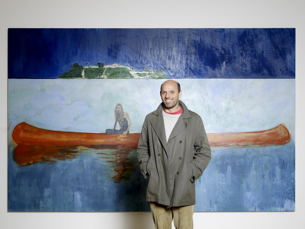
The VMFA is conveniently only two miles away from my house so I headed out without much of a plan. They had recently set up a new exhibition called “Edward Hopper and the American Hotel” which sounded interesting, so I decided to dive in. The initial emotions I felt while looking at many of his pieces were a sense of pensive loneliness and isolation. As I looked at more of his work, I felt as if each showed a short but detailed vignette of American people and their surroundings. The VMFA provided a “road map” which pieced his works together in a story of American life in the 20th century which I thought was helpful. Through reading this and other signs, I could see the different perspectives of hotels that Hopper was able to portray. He displayed motels, with cars parked visibly in the window, tourists resorts, and neighborhood hotels, each with a distinctive feeling connected to it. He spent much of his time on the road, so he was well acquainted with the hotel setting, and able to capture them in his work. He would observe the behaviors of these temporary residents and make sketches of people reading in the lobby or sitting on a simply made bed. Then, after careful consideration and planning, he would create longer term artworks in oil paint and watercolors. I am curious about if he uses models in his paintings or if he creates the images from his head. I also wonder if he preferred the scenes with or without figures. I admire the softened realism of his style and his carefully balanced compositions. Over time, his compositions became more simplified, emphasizing a feeling of emptiness and effectively putting the viewer in the setting of a hotel. Overall I appreciate his work and diversity of pieces he was able to create under this concept of american hotels.
0 Comments
 Biographical Information Education: BA from St. Martin's School of Art, MA from Chelsea School of Art Exhibitions: Tate Britain, Dallas Museum of Art, Bonnefanten Museum, Whitechapel Art Gallery, Scottish National Gallery, Montreal Museum of Fine Arts, and more Recognition: First prize at the John Moores exhibition in 1993 propelled his career. He also was nominated for the Turner Prize and was the 2017 Whitechapel Gallery Art Icon. Website: unfortunately, I could not find his personal website but her is an informational site: http://www.artnet.com/artists/peter-doig/
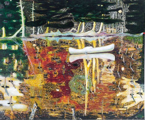
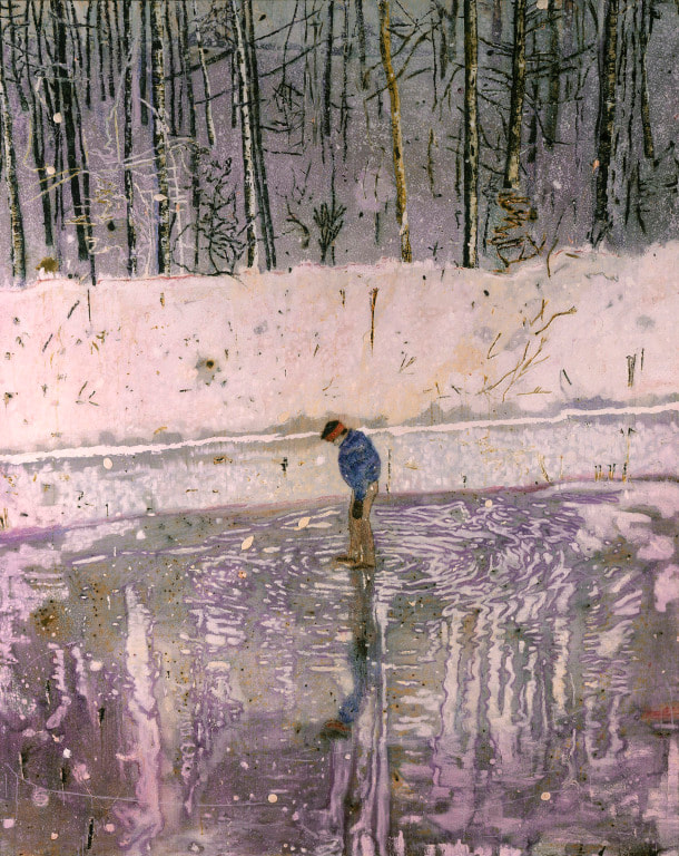
Response I have a tendency to go in circles deciding between artists when doing awareness posts, so this time I tried to dive into an artist’s work which immediately drew me in without hesitating. Peter Doig’s work definitely had that effect on me, and though he is quite a widely renowned artist, I knew next to nothing about him in the beginning. The artwork of Peter Doig is strongly connected to magical realism with his chaotically colored paintings with reflections and landscapes which border between real life and fantasy. I appreciate that when looking at the two paintings above, I can identify the objects, but there is a surreal movement to the pieces as well. The brush strokes are very animated and broad yet still have a purpose to them, which I have attempted to portray in my work as well. I also feel as if the compositions are dynamic, despite using horizontal and vertical lines, since the lines are loosely painted and intersect. He has mentioned how he builds up many layers before he is satisfied with his work and I would like to work with layering paint more to create more depth as well.
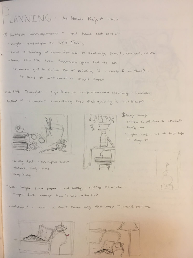
11/13/19 I added in the background and overall, I think it looks pretty good. I am going to mat it so that the unfinished left edge is covered and if I have extra time, there are some things I could blend or refine, but I believe its time to put it down. 11/12/14 Man oh man the shoe took a while, but it is by far my favorite part of this piece (even though it was done rather late at night). I am really happy with how the soles turned out and the slightly reflective stripes on the side. I also dealt with details such as the rope and the mesh on the lunch box. The rope definitely put my knowledge of braids to the test. Before I’m done, I was to resolve the background so I’ll probably add the suggestion of corner of the room at the upper left. 11/11/19 I pressing on pretty slowly and as we get closer to the deadline, the amount of time is yet again making me nervous. I began the glasses, which turned out to be not that bad after I got the general shape down. There is some subtle foreshortening so I wanted to make sure the glasses didn’t just look wonky. I darkened some areas up, but I think at the end I will want to go back and create some more contrast. Maybe I’ll try and find a darker pencil too. 11/4/19 I started the piggy bank today, which was a difficult task. I think it needs some more work but I need to step away from it right now. The reflection on it doesn’t look realistic, so might take some artistic liberties. I also did the rubix cube but that was a pretty simple form. 10/28/19 I did a bit of blending, which really helped fill out some shapes and smooth out the areas I worked on. I want to keep some of the texture though, because the sweatshirt is looking a bit silky right now. I am getting some little patches from my graphite covered knuckles but for the most part, I just rest it on a sheet of paper and I am fine. I am currently avoiding the glasses because they intimidate me. 10/21/19 I worked my way around the piece because I got bored with the fabric. I should probably have started in the upper right hand corner to minimize smudging but it should be okay. Also, I talked to Mia and she suggested using lighter pencils to fill in the tiny white holes in the shadows so the darks look darker. I will try that out later. 10/14/19 Working on such a large piece of paper, I am beginning to realize just how long it will take to create something realistic. I began to work on the folds of fabric from my hoodie and so far it is still very rough in that section. I am trying to emphasize the darks and the lights before I smooth things out so that I don't lose the contrast. 10/7/19 At this point I think I have finished with the contour of the still life so the next session will be adding value. Drawing the glasses (which I almost forgot to do) was definitely the most difficult part since the perspective is so odd, and I still do not think they look quite right. I will probably end up redoing them. I also have not decided how I want to approach the back wall in the piece because including it clues the viewer into the angle of the piece but I don't know if its distracting. 9/30/19 I started working on the rough sketch of the still life and so far things are going smoothly. proportion is a bit difficult with so many objects in different orientations but I don't believe anything looks too out of place. I am comfortable working in pencil, but I believe the challenge will come when I get to adding value. 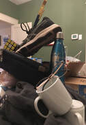 9/23/19 I spent a long time gathering things in my house and attempting to make a tower out of them which was an equally frustrating and entertaining experience. I wanted to give the feeling of instability without the set up actually being so unstable it falls. To the right is an image of the general set up and I didn't even need to use tap or glue to keep it standing. For the actual piece, I decided to rotate my perspective to emphasize the element of topsy turvy.
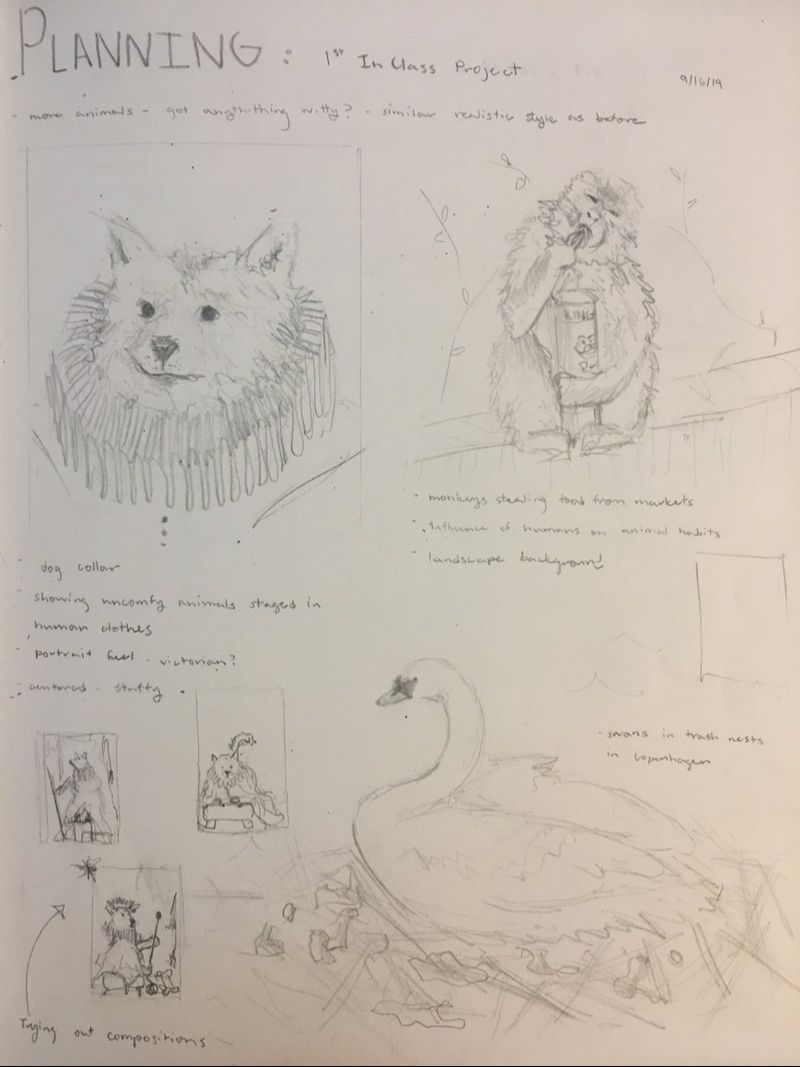
10/9/19 I've started to put paint to canvas which is exciting but I am still figuring out how I want the finished product to look. I spent a while pondering over colors but at the moment I have gone for a yellow background to complement the purple and pink foreground. I need to make the dog the center of attention so I think I will end up dulling the colors that surround him. I'm not used to working in such bright colors, so I am trying to find a balance of feeling like you are in a child's room but not appear as if a child painted it. 10/7/19 I have for the most part finished the initial sketch for the painting. I decided to follow the idea that the dog is stuffed into an uncomfortable position and staged in a child's room attempting to recreate renaissance portraits. I spent a while on the face attempting to make it appear awkward. I think it looks okay now but it will probably be ignored by paint. My goal was to focus on creating a more dynamic composition witch incorporated a more developed background and I think this drawing is a step in the right direction. It was a bit of a race to the finish and on Friday I worked during lunch and study hall to try the create some finality to it. I added in the crown using some metallic paint I found left in the bottom of the golden acrylic box. I was originally going to keep it matte but it looked fun so I decided to use it instead. I also finished the bottom of the drapery and added some more layering around the piece, darkening and brightening some areas for contrast. I made the staff look like an actual stick and I actually really like how that turned out. Overall, there are still some changes I would like to make if I ave time to come back to it. I think i may want to add the jewelry and crown details that I had in the original sketch. I would also like to create more depth by muting or darkening the background so the dog pops forward more.
|
Hello Everyone!I am a Maggie Walker art student in Richmond, Virginia. This blog section is a little window into my art process, research, and experiences. You can follow along with my journey as you scroll. Archives
March 2020
Categories |
 RSS Feed
