|
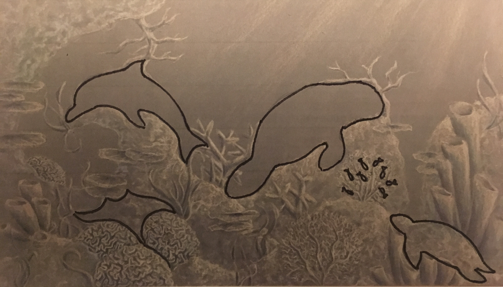
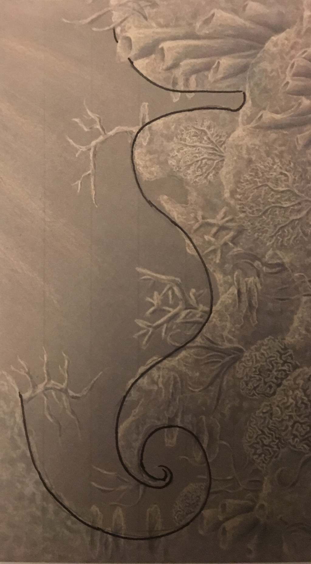
Through this piece, I hoped to communicate the idea of the disappearance of wildlife in the ocean by emptying the scene of the animals which are usually the subject of my work and instead leave only a suggestion of their outline. Try to look closely and find the creatures before scrolling down to see where they are in the next picture. Sorry that the picture quality isn't the best but I will try to post a better one by Wednesday. Questions While overall I enjoyed making this piece, what bothers me is how flat it looks. Do you have any suggestions to help with this in the future? Should I continue this train of though with drawing or return to painting? Should I add another color such as an orange-ish coral color to make the piece pop or is the monochrome more effective in the context of a fading coral reef? 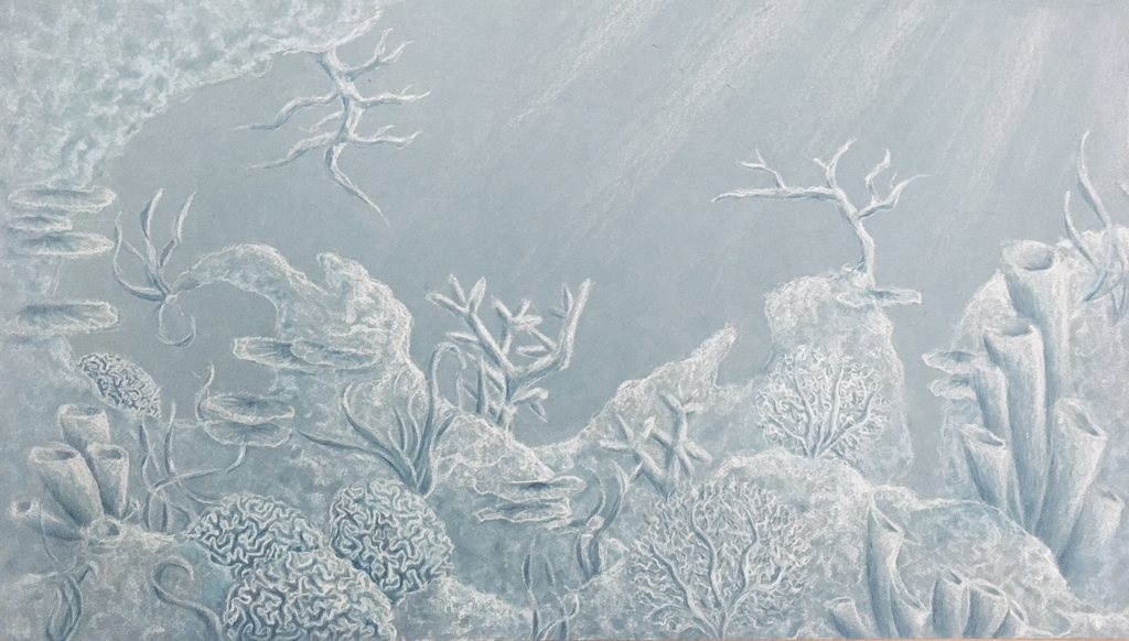
7 Comments
Reflection
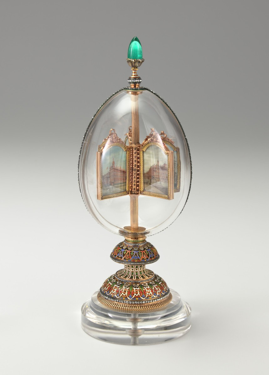
I remember walking into the Faberge exhibit in the VMFA and feeling like a magpie, attracted to all the glitter and shine in the intricately created details. There is an amazing level of craft and skill in each unique piece, and it was interesting to listen to the history behind these works of art during this lecture. Through the presentation, we could follow the paths of the Faberge eggs as they gained value and prestige. For example, one egg was originally given to Alexandra Feodorovna by Tsar Nicholas II which costed what would now be $130,5442. However, recently the third Imperial Easter Egg (above) was recently sold for about $33 million in what I found to be an almost movie-like scenario of a man buying the egg at a flea market. These pieces truly exude excess, and the company made everything from cane toppers to cigarette cases beautiful, so that you could be luxurious from head to toe. I often got lost in the winding trails that the eggs left as they traveled from one owner to the next with mark ups in between, but i think this elaborate path shows just how sought after these eggs are. Also, the idea that there are more eggs that are still missing leave a bit of mystery and an invitation for a treasure hunt with each story. From an aesthetic perspective, I appreciate how intricate the designs were and how carefully each one was planned out. They even all got their own individual box, which I think is adorable. There is also an interesting play of layering that is used in these pieces. While the outside of the egg is magnificent, there is additional treasure within, such as a miniature statue, portrait, or watch. I wonder: how much of the design was from the client's wishes and how much was the prerogative of the artist? Though my art is pretty different from the world of Faberge, what I take away from the lecture is the beauty of a carefully crafted piece and the interest and depth that can be created with different layers. 3/24/20
I sort of pushed through and got the rest of the piece done. I'm pretty happy with how it turned out. I decided to add two darker tones so that the shapes were more defined. It still looks a bit flat, but at this point I am not going to worry about it too much and think about how to fix it for the next piece. I also just love the color blue, so the cool blue hues in the piece make me very happy. I also love the amount of variation in corals though I am worried they all blur together. 3/20/20 I spent considerably longer than the time I initially gave myself but I got done a base layer of white. The outlines of the animals are a lot less obvious so you have to search a bit more to see them, which I like. I am thinking that maybe when I present it I will put some explanation and key with it so that people don’t completely miss the point of the piece. I was originally thinking that I might just use white, but I think it will help if I go in with some blues to create some more defined shadows and forms (though part of me does like the ethereal feeling it has now). 3/18/20 Did I procrastinate? Maybe a little bit. But I am starting now so I will have plenty of time during this Coronacation to get it done. I was hesitant to start because there are still some things I haven’t worked out yet, but at this point I just needed to put pencil to paper and hope my worries get sorted out as I go along. I started with just drawing lightly in pencil which I will erase later so that I could make sure I got the entire composition to fit. I think it looks alright at the moment, Next time I will replace what I have with the white. 3/16/20 I decided I still wasn’t ready to start the actual piece so instead I did some more searching around to find some different cool corals to include in my piece. I tried to include a lot of different shapes so that there would be a nice variety and they would be able to fit the shapes of the hidden animals. 2/12/20 Though I do have some preliminary sketches, I am still very uncertain as to how I want to approach my at home project idea. I am planning on creating a ocean scene in which you can see the silhouettes of sea creatures in the negative space. However, none of the sketches so far are speaking to me. I am fairly sure that I want to draw this one since I have a large toned canvas that I want to use, and I have not done a long term drawing since the first at home project. 3/9/20
It's all done! I think the background really helped to tie the piece together and help with the flow and composition. The seaweed itself is a bit clunky but I think I will just have to call that a learning experience and fix it for my next piece which will probably also have some seaweed. Overall, i am pretty happy with how the piece turned out and I am proud that despite it being larger than my other pieces that the project didn't drag out for too long. I love the color combination and texture that I used. 2/25/20 Okay, I think I am going to actually step away from the seahorse now and do the background next. I am getting to this a lot later than I anticipated but I guess I’ll just have to keep moving forward. This week, I had a bunch of other tasks for YAMM that had to get situated so some of my painting time got cut short. I am happy with the way that the fin turns out, and how the lighter blue gives the illusion of a translucent film. I think for the background, the seaweed will be a blue-green to match the undertones in the water, and hopefully that will add depth and dimension 2/19/20 I definitely feel myself slowing down the pace a bit. Maybe it's because I was feeling a bit more uncertain about the tail part of the seahorse because I had to alter it from what the reference for the head looked like. At this point, I like the way the animal itself is coming together, but I don’t think it clicks as a piece as a whole yet. Maybe I will end up painting in the belly, but I feel like that gets rid of my original concept. I am going to do the background before I make that kind of decision though. 2/12/20 I added a bit more to the background, which you can't really tell. The most obvious thing is that I began painting the seahorse. It is a very, very vibrant coral color which I think complements the ocean well but i hope that the white and more muted detailing will subdue it a little bit. Also i spent a while considering how I want to add in the seaweed, but that will come later. 2/10/10 I decided to keep the composition as it was and began painting the background today. I actually got farther than I thought I would and so now all of the background is at least covered in some paint. I do think I will add some more texture though. This is different from previous paintings where I start with the subject, but then getting in the crevices is always difficult so I hope this makes the process easier for me later 2/6/20 I spent some more time thinking today, but eventually I did settle on something. Originally I had decided to revert back to my three canvas plan, but in the last couple minutes of class, i decided it might be interesting to add two more canvases. I am still unsure about the current composition so I might rotate or adjust before I begin painting. 2/4/20 I am currently still brainstorming ideas for this project at the moment but hopefully by the end of the week I will have at least completed a rough sketch of what I want to do. I want to scale up a little bit this time so that it fills the space a bit better, but I am worried that I will loose the refinement that my smaller pieces sort of have. I am leaning towards making the subject of this one a seahorse, since I think it would be interesting to contort and also play with flowing seaweed surrounding it. 1/13/20
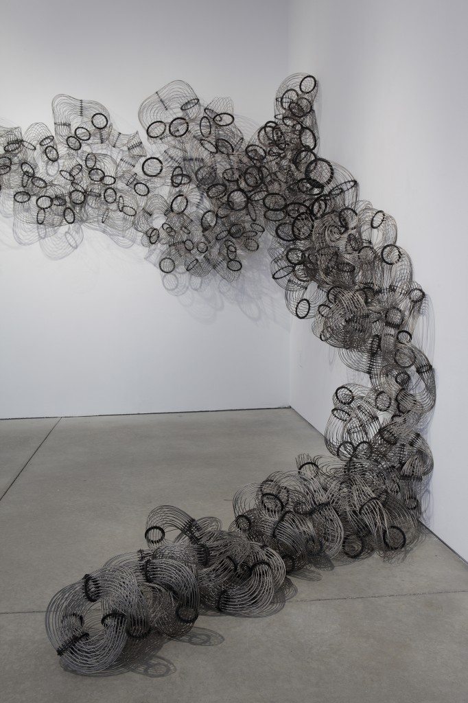
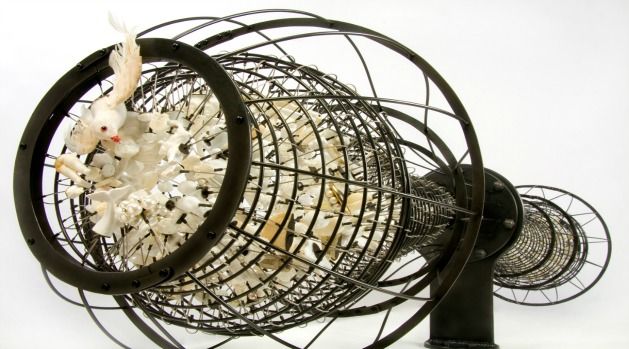
I spent the entirety of class on this annoying little can of oil and I am not even done with it. I think it looks pretty good so far, but it is taking up a lot of time (and I don’t have a lot of it left). I was going to leave words out of this painting, but I wanted to make sure that people knew that it was oil and not just a random container. 1/8/20 I did the background, and it added some much needed contrast. I am hoping that the transition from nearly black to deep blue will add subtle interest and tie back into the whale painting. I feel as if the octopus and the background do not feel well incorporated so I will need possibly blend out some areas. 1/6/20 In class today, I discussed what my plans were for the rest of the piece, and right now I have a couple ideas that are swimming around in my head. I may add plastic wrap just as before, or clump it is swirls to weave in and out of tentacles. I could also pour a very glossy finish or add wire to finish the cropped tentacles. I also started on the suction cups, but I didn’t get very far. 12/28/19 I deepened the shadows in order to accentuate the fact that the light is being softly filtered through the water from above. Also, since it will be holding the oil at the bottom, I wanted the make the tentacles appear almost stained. I painted the eye, which is a small detail but it really helped the octopus come alive and I am happy about how it turned out. 12/17/19 I am adding on layers of paint to give more depth to the animal. At one point the canvas shifted, so I made the tenctacles line up in the wrong sport and had to move them, which consumed a bit of my time. The piece is moving along slowly as I continue to work on the top skin of the octopus. I like the texture that I am able to create by dabbing the paint on with the brush. This style is much rougher than the whale but has similarities to the cow I painted last summer. It makes the skin look weathered and bumpy which is true to an actual octopus. 12/26/19 I wanted to create a painting that would be similar to the whale, yet still a distinct piece. I chose to stay under water and decided that it would be interesting to experiment with the winding and curling tentacles of an octopus. I used a hodgepodge of different references, so it took a while to create a sketch that looked like an octopus but was in the position that I wanted. After this, i put on a quick layer of paint to get a better idea of the movement. At the moment, it looks like an octopus, but it isn’t a particular kind of octopus so I might need to make up my mind and choose one.  Biographical Information Education: Ganch received her B.S. in geology and later M.F.A. at the University of Wisconsin-Madison Exhibitions: National Gallery of Victoria, Cameron Art Museum, Boston Museum of Fine Arts, Kohler Art Center, and more have held her exhibitions. Also, she has had exhibitions at the Visual Arts Center and the VMFA in Richmond. Recognition: She has received multiple grants and fellowships through VCU such as Dean’s Exploratory Grant. She won other honors such as the Teresa Pollock Award fro Fine Art and was a nominee for USA Fellowship Award. Current Occupation: In addition to creating art, Ganch is Associate Professor and Metal Area Lead at Virginia Commonwealth University. She also leads workshops and directs a collaborative initiative called Radical Jewelry Makeover. Website: https://susieganch.com/home.html
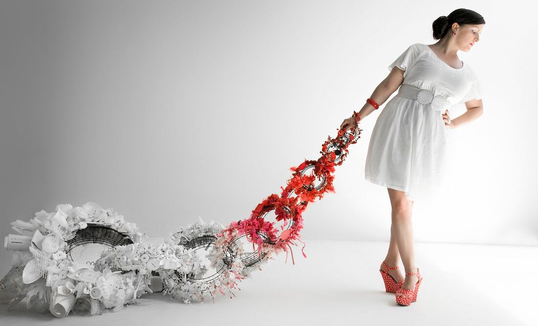 Credit Lines: Bottom: Drag Object, 2013-2014, mixed media and steel, 132 × 36 × 36 in Top Right: Labor, 2014, Steel and brass, Dimensions variable (20’ in gallery image) Top Left: Falling in Love: 1999, 2011-2013, Mixed media, collected detritus, and steel, 62 × 12 × 12 in Video: the video is embedded into this website where there is also additional information on the artist https://siennapatti.com/news/susie-ganch-video/ Response
This artist was recommended to me and I was curious to learn more about her. It was interesting to find out that she actually works right down the street and has had exhibitions in places that I go often, so I recognized some of her work. First, I examined a work titled Labor. The way the industrial wiring was manipulated to for an organic shape was very visually interesting (and reminds me a bit of a free spirited slinky). The form had a feeling of being adaptive, which is further shown in the credit line which mentions that the “dimensions are variable” and conform to the gallery space. While I enjoy her work using wire and steel, the pieces which particularly caught my eye are those also using found objects and detritus. I am currently exploring ways to incorporate discarded objects into my pieces, so examining her approach was a helpful source of inspiration. I appreciated how from afar, you could hardly tell that the sculpture was made up of trash, especially since much of this work uses a lot of white which I wouldn’t normally associate with debris. However, once you look more closely, you notice the individually attached object, some stained from wear. Pieces such as Drag Object and Falling in Love address consumerism and its effect on the world which relates to my content of conservation of the natural world. Overall, I usually gravitate towards figurative work, but her pieces appeal to my love of pattern and detail. In future projects, I may use a monochrome conglomeration of detritus to enhance my drawings or paintings. Reflection
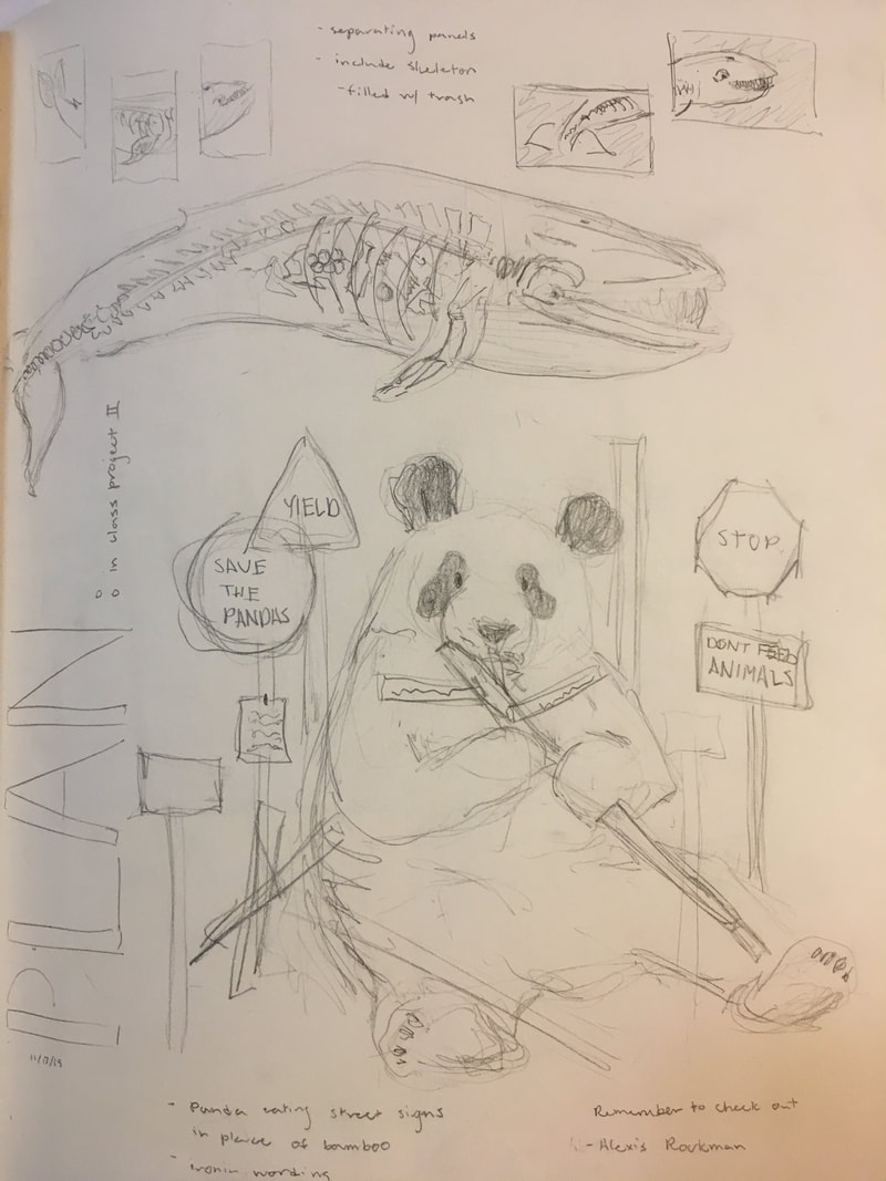
Even though I am not applying to any art colleges, this was an informative lecture. Despite the fact that the inner workings of art college to not specifically apply to my path, I was still curious to hear how the process worked. Fro someone who is truly passionate about art, I can see the appeal of focusing very specifically on the field. I wish to continue my study of art into college, but it will likely be much more informal or supplemental. I know this question does not apply directly to the panel, but while listening, I wondered about how open liberal arts schools are to students in other majors getting involved in the art community. I want art to be something that adds to my career driven studies and hope that I will be able to some classes in whichever college I attend so that I can access their resources both in the material and mentor sense. The access to an abundant source of opportunities was highlighted by the panel and is something I also look forward to, and I believe that working with teachers who excess in their field is an advantage which will apply to all areas of my study. I feel that my interests most closely align with Bailey’s path. Architecture is something which has bounced around in my mind at some times as I like that it combines creativity, geometry, finance, and an overall attention to detail. In similarity with him, I also like being given guidelines to expand upon. The alumni also made good points on the college experience in general. I appreciated how they emphasized that you should seize the opportunities you can and be grateful for the experiences that you get. I hope college will be the place where I find a clearer direction for myself and I will work hard to get to that point. 12/9/19 I added the background as a solid greyish blue color because I wanted the tone to contrast the darkness of the whale. After the entire thing had dried, I thought it would be a good idea to try and add a gradient, but that ended up as a waste of time as it didn’t blend easily into the old color and ended up not showing very clearly in the finished product anyway. Thankfully it did not make the piece worse, but it was definitely not a good use of my time. I knew that the background was still missing something, and it had been suggested that I add fish or trash to the background, so on an impulse I decided to cover the entire thing in plastic wrap… and I honestly really liked it. I thought it was a perfect finishing touch. 12/4/19 I had been putting it off long enough and finally decided it was time to paint the trash in the stomach. At first I was worried about how I would portray a bundle of bleh, but then I actually enjoyed creating tiny plastic bottles and cans which you can only see if you look really, really closely. 12/2/19 I worked on the bones and I decided to go with off white and brown to create a more natural look that wasn’t so stark. Indicating each little bone is time consuming but I think it’s worth it. 12/1/19 I worked on some more detailed areas today which were a bit more finicky. The brush I have is small but doesn’t seem small enough and some of my lines aren’t very clean. It took a lot of layering, especially for the mouth, to get the subtle textures, and I’m not sure if they came through. Overall though, I think it’s looking pretty good so far. 11/29/18 I have started to work on the painting and I am taking over the kitchen with my mess at the moment. I have begun by putting down a base layer of color and building a gradient. This part wasn’t too difficult and I really like the color of the whale. 11/25/19 I did the sketch of my painting today which didn’t take too long. It is pretty rough but I am happy with the general layout. I think I am going to want to hang this piece so that the panels are a little bit separated from each other 11/20/19 After a whole lot of planning and going back and forth between ideas, I have finally settled on what I am going to do for this piece. The plan is to paint a whale across three panels and on the middle one paint sort of an x-ray which will show the bones of the animal and also debri from the ocean floating inside. I don’t know how realistic this task is given the time but I will have time over the break to work on it as well.
Review
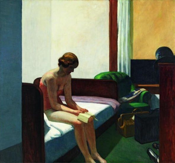
The VMFA is conveniently only two miles away from my house so I headed out without much of a plan. They had recently set up a new exhibition called “Edward Hopper and the American Hotel” which sounded interesting, so I decided to dive in. The initial emotions I felt while looking at many of his pieces were a sense of pensive loneliness and isolation. As I looked at more of his work, I felt as if each showed a short but detailed vignette of American people and their surroundings. The VMFA provided a “road map” which pieced his works together in a story of American life in the 20th century which I thought was helpful. Through reading this and other signs, I could see the different perspectives of hotels that Hopper was able to portray. He displayed motels, with cars parked visibly in the window, tourists resorts, and neighborhood hotels, each with a distinctive feeling connected to it. He spent much of his time on the road, so he was well acquainted with the hotel setting, and able to capture them in his work. He would observe the behaviors of these temporary residents and make sketches of people reading in the lobby or sitting on a simply made bed. Then, after careful consideration and planning, he would create longer term artworks in oil paint and watercolors. I am curious about if he uses models in his paintings or if he creates the images from his head. I also wonder if he preferred the scenes with or without figures. I admire the softened realism of his style and his carefully balanced compositions. Over time, his compositions became more simplified, emphasizing a feeling of emptiness and effectively putting the viewer in the setting of a hotel. Overall I appreciate his work and diversity of pieces he was able to create under this concept of american hotels. 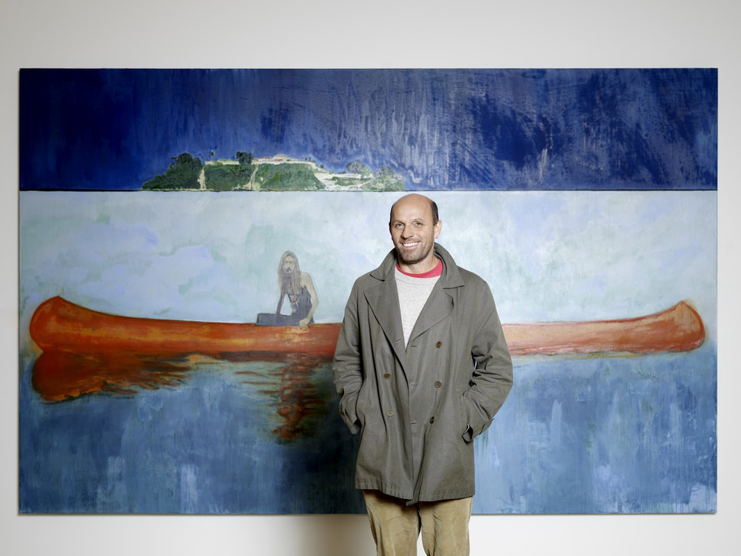 Biographical Information Education: BA from St. Martin's School of Art, MA from Chelsea School of Art Exhibitions: Tate Britain, Dallas Museum of Art, Bonnefanten Museum, Whitechapel Art Gallery, Scottish National Gallery, Montreal Museum of Fine Arts, and more Recognition: First prize at the John Moores exhibition in 1993 propelled his career. He also was nominated for the Turner Prize and was the 2017 Whitechapel Gallery Art Icon. Website: unfortunately, I could not find his personal website but her is an informational site: http://www.artnet.com/artists/peter-doig/
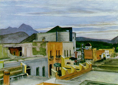
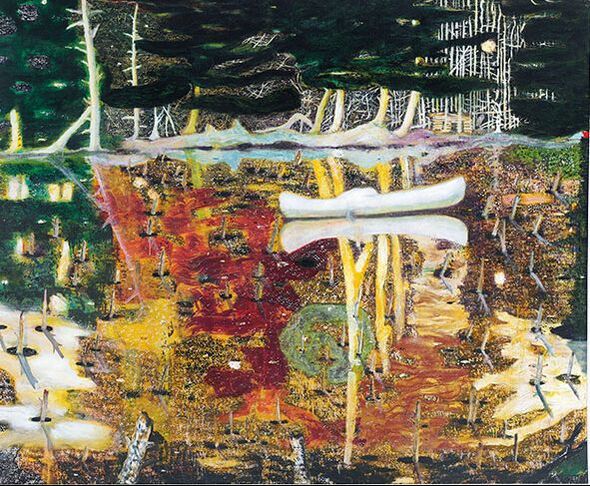
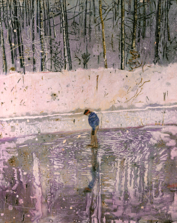
Response I have a tendency to go in circles deciding between artists when doing awareness posts, so this time I tried to dive into an artist’s work which immediately drew me in without hesitating. Peter Doig’s work definitely had that effect on me, and though he is quite a widely renowned artist, I knew next to nothing about him in the beginning. The artwork of Peter Doig is strongly connected to magical realism with his chaotically colored paintings with reflections and landscapes which border between real life and fantasy. I appreciate that when looking at the two paintings above, I can identify the objects, but there is a surreal movement to the pieces as well. The brush strokes are very animated and broad yet still have a purpose to them, which I have attempted to portray in my work as well. I also feel as if the compositions are dynamic, despite using horizontal and vertical lines, since the lines are loosely painted and intersect. He has mentioned how he builds up many layers before he is satisfied with his work and I would like to work with layering paint more to create more depth as well.
|
Hello Everyone!I am a Maggie Walker art student in Richmond, Virginia. This blog section is a little window into my art process, research, and experiences. You can follow along with my journey as you scroll. Archives
March 2020
Categories |
 RSS Feed
