|
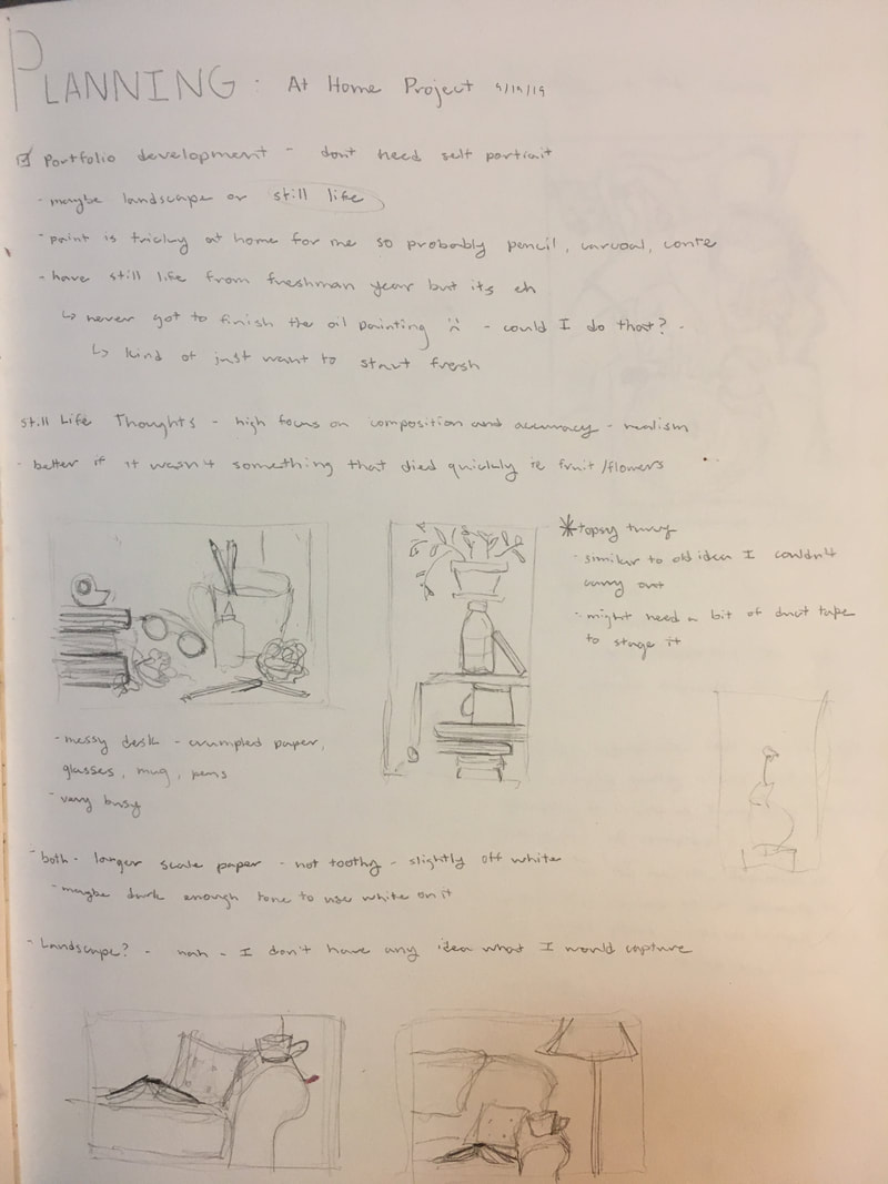
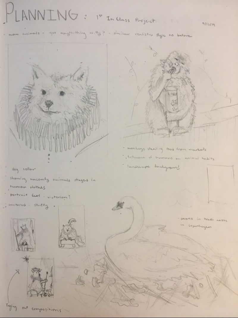
11/13/19 I added in the background and overall, I think it looks pretty good. I am going to mat it so that the unfinished left edge is covered and if I have extra time, there are some things I could blend or refine, but I believe its time to put it down. 11/12/14 Man oh man the shoe took a while, but it is by far my favorite part of this piece (even though it was done rather late at night). I am really happy with how the soles turned out and the slightly reflective stripes on the side. I also dealt with details such as the rope and the mesh on the lunch box. The rope definitely put my knowledge of braids to the test. Before I’m done, I was to resolve the background so I’ll probably add the suggestion of corner of the room at the upper left. 11/11/19 I pressing on pretty slowly and as we get closer to the deadline, the amount of time is yet again making me nervous. I began the glasses, which turned out to be not that bad after I got the general shape down. There is some subtle foreshortening so I wanted to make sure the glasses didn’t just look wonky. I darkened some areas up, but I think at the end I will want to go back and create some more contrast. Maybe I’ll try and find a darker pencil too. 11/4/19 I started the piggy bank today, which was a difficult task. I think it needs some more work but I need to step away from it right now. The reflection on it doesn’t look realistic, so might take some artistic liberties. I also did the rubix cube but that was a pretty simple form. 10/28/19 I did a bit of blending, which really helped fill out some shapes and smooth out the areas I worked on. I want to keep some of the texture though, because the sweatshirt is looking a bit silky right now. I am getting some little patches from my graphite covered knuckles but for the most part, I just rest it on a sheet of paper and I am fine. I am currently avoiding the glasses because they intimidate me. 10/21/19 I worked my way around the piece because I got bored with the fabric. I should probably have started in the upper right hand corner to minimize smudging but it should be okay. Also, I talked to Mia and she suggested using lighter pencils to fill in the tiny white holes in the shadows so the darks look darker. I will try that out later. 10/14/19 Working on such a large piece of paper, I am beginning to realize just how long it will take to create something realistic. I began to work on the folds of fabric from my hoodie and so far it is still very rough in that section. I am trying to emphasize the darks and the lights before I smooth things out so that I don't lose the contrast. 10/7/19 At this point I think I have finished with the contour of the still life so the next session will be adding value. Drawing the glasses (which I almost forgot to do) was definitely the most difficult part since the perspective is so odd, and I still do not think they look quite right. I will probably end up redoing them. I also have not decided how I want to approach the back wall in the piece because including it clues the viewer into the angle of the piece but I don't know if its distracting. 9/30/19 I started working on the rough sketch of the still life and so far things are going smoothly. proportion is a bit difficult with so many objects in different orientations but I don't believe anything looks too out of place. I am comfortable working in pencil, but I believe the challenge will come when I get to adding value. 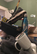 9/23/19 I spent a long time gathering things in my house and attempting to make a tower out of them which was an equally frustrating and entertaining experience. I wanted to give the feeling of instability without the set up actually being so unstable it falls. To the right is an image of the general set up and I didn't even need to use tap or glue to keep it standing. For the actual piece, I decided to rotate my perspective to emphasize the element of topsy turvy.
0 Comments
10/9/19 I've started to put paint to canvas which is exciting but I am still figuring out how I want the finished product to look. I spent a while pondering over colors but at the moment I have gone for a yellow background to complement the purple and pink foreground. I need to make the dog the center of attention so I think I will end up dulling the colors that surround him. I'm not used to working in such bright colors, so I am trying to find a balance of feeling like you are in a child's room but not appear as if a child painted it. 10/7/19 I have for the most part finished the initial sketch for the painting. I decided to follow the idea that the dog is stuffed into an uncomfortable position and staged in a child's room attempting to recreate renaissance portraits. I spent a while on the face attempting to make it appear awkward. I think it looks okay now but it will probably be ignored by paint. My goal was to focus on creating a more dynamic composition witch incorporated a more developed background and I think this drawing is a step in the right direction. It was a bit of a race to the finish and on Friday I worked during lunch and study hall to try the create some finality to it. I added in the crown using some metallic paint I found left in the bottom of the golden acrylic box. I was originally going to keep it matte but it looked fun so I decided to use it instead. I also finished the bottom of the drapery and added some more layering around the piece, darkening and brightening some areas for contrast. I made the staff look like an actual stick and I actually really like how that turned out. Overall, there are still some changes I would like to make if I ave time to come back to it. I think i may want to add the jewelry and crown details that I had in the original sketch. I would also like to create more depth by muting or darkening the background so the dog pops forward more.
Ivory Keys This is an idea I had sketched out at the beginning of the summer, but I originally was not going to carry it out because I had recently completed an elephant in the same medium. However, it was an idea I thought was interesting and I thought conte would be able to capture the rough, wrinkled texture of the animal well.
I spent a bit of time roughly figuring out how the elephant would be positioned (I didn't include them because they are really ugly and don't make much sense). I looked at a bunch of pictures of elephants which was very entertaining and helped me to understand how the elephant would theoretically contort itself into a piano bench. Once I got started on the sketch for my final piece, I had some issues making the proportions look natural. Even now, there are definitely some issues, but I think elephant looks like it could be in the realm of possibility even though the head looks big. After having the sketch done, the conte was a relief since I knew generally where I wanted to put my lines. I loved creating all the little wrinkles and shadows. I hadn't picked up a conte crayon in a while so working with such a small instrument took some getting used to but I didn't have too much trouble. After I had finished the elephant, I went back to the piano since the perspective still seemed wonky and then tried to figure out how to approach a smooth, shiny surface with conte. I feel like the piano could still use a bit of work but I'm not sure what I'll do to improve it. The last thing I did was add white highlights which is what I think really helps bring the piece together. Artist Statement I wanted to create a sense of irony as an elephant plays on the ivory keys of the piano. The slightly absurd scene addresses the tragedy of poaching for the ivory of elephant tusks. I was kind of having an artist's block and I wasn't really in love with any of the sketches I made in the previous post. I had sort of stressed myself out about having something that would be perfect (as I do), but that isn't the point of this assignment or art in general, so I decided that I would grab some paints and create something that would make me happy. My mom loved the idea of painting a cow, especially since it would connect to the family's mountain house where there are often cattle grazing. Painting this piece really felt like it was from the heart and is linked to the many animal drawings I have been creating recently. There were a couple frustrations along the way as the paint I was using wasn't as opaque or thick as I would have preferred, but it worked out with a lot of layering. Also doing the grass was very tedious and I am not completely happy with it. I was trying to create variation and texture but it still looks flat. Overall, I think she is very cute and I love how the over saturated orange and blue complement each other in the cow. There is definitely room to improve but I think I am getting better at these mini paintings.
Artist Statement My family has a house in the mountains which is very dear to me where we raise cattle. Following my journey of portraying animals, I wanted to depict the serenity I feel while at this spot through a calmly resting cow.  I have drawn some really, really rough sketches of some ideas I have had so far. I am not completely happy with any of them and have not settled on anything yet but at least we have some graphite on the paper. I hope my notes are legible because some of them may help decipher the drawing. It makes me sad but we have simply run out of time in the year. I want to be able to finish this piece but I don't know when it will happen. It was good practice for the beginning of the oil paint process.
5/31/19 I have started with the grisaille and its going okay. The background is a bit streaky so I will need another coat of paint. I definitely need to work a bit more on this step before i am ready to move on. 5/24/19 I am almost finished with the brunaille now. The painting is still very light but I will define more values with the grisaille. So far, I am really liking the way the pear is turning out but I am worried about getting clean and straight lines for the cup and jar. 5/22/19 I'm getting started on the brunaille and right now it is basically a line drawing but I was able to fix a couple issues from the sketch. The flower is giving me some difficultly so I will probably wait until the grisaille before I attempt any more detail. 5/20/17 I spent a while choosing my composition but I settled on this one and I think it will be interesting to paint, if not a bit difficult for some parts. I am mostly done with the under drawing, but some things are still a bit wonky.
Reflection
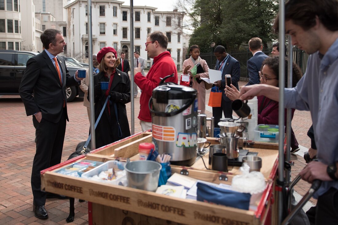
John Freyer is an educator at VCU as well as an artist and an author. He has mobilized projects such as Free Ice Water, Free Hot Coffee, and Free Hot Supper in an effort to enrich social ties in the community. These art works art not traditional paintings in museums, but rather they are concept based and extend into the real world. His Free Hot Coffee project began within an addiction support group called Rams for Recovery. In an effort to give back to the group which supported and encouraged him on his journey, he provided coffee for one of the meetings. His contribution gradually expanded and became more popular and now he has a bike with coffee stand attached allowing him to branch out into the city. He rides around the community, connecting with individuals and reducing the stigma around addressing addiction. I think this is a great idea, and I think especially in the winter, he could consider providing free hot chocolate or tea too if they wanted to further expand the operation. I was also interested in the Free Ice Water project. This initiative involved sitting down with someone you may not know and having a conversation with them as you drank your glass of water. While this would definitely be out of my comfort zone, it would be a good exercise in connecting with new people and focusing on listening in the moment. Unfortunately, I could not actually attend this lecture so I did not receive any free coffee or water, but I was still able to learn a lot by watching the lecture on video, and who knows, maybe I’ll see him somewhere on the streets of Richmond! Sources to Explore The official Fifty-Fifty website, which it the overarching organization that links all of Freyer's projects: http://fiftyfifty.country/ Freyer brought his Free Hot Coffee overseas, and you can learn more about his trip to London with this link: https://www.richmond.com/entertainment/art/richmond-artist-brings-his-free-hot-coffee-bike-to-london/article_585947ea-6931-5445-96dc-a068805d8979.html
Reflection
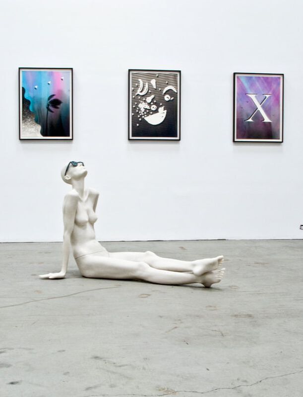
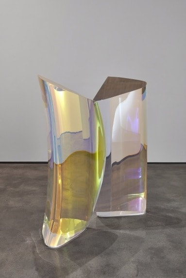
Try-Me is the location of private art collection which was previously a factory for Try-Me Soda. It contains a wide range of art by numerous artists from the unknown Philadelphia Wireman, to the well known Kehinde Wiley. I appreciated being invited to this gallery with its extensive collection of art pieces. When I walked in, the first piece I noticed was Plasma Stone II by Mariko Mori. It was an arrangement of two giant, acrylic coated forms. The way the piece morphed as I walked around it and how light was refracted through the piece was captivating. The purpose of this piece was to attempt to capture the essence of the universe and while that is no small task, Mariko Mori executed a commendable interpretation of this concept. I was also interested to learn about the process of the piece’s installation. The amount of machinery and people it took to move the extremely heavy work of art showed just how logistically difficult it is to run a gallery. In addition to Mori’s piece, I was also interested in Monument to Fashion Evan Gruzis. This sculpture explores the shallow vanity prevalent in today’s society by depicting a mannequin with glasses nonchalantly reclining. His work is subtly mocking and ironic to the fashion world which I find intriguing. Also, part of the reason I was interested in this piece was due to the fact that I could draw parallels with my sculpture. While the message is different, we both employ the use of simplified and generally unadorned figures. Overall this trip was a great experience and I also enjoyed exploring on their website to see works that were not displayed. I hope I get the opportunity to return! Sources to Explore Mariko Mori's Website (which has more really interesting large scale pieces): https://www.skny.com/artists/mariko-mori Evan Gruzis' Website: http://www.evangruzis.com/ 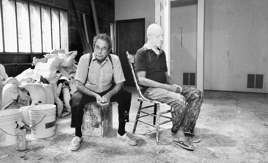 George Segal in his studio, in the process of making a plaster cast Overview George Segal was born in New York City as the son of Jewish immigrants. He developed a passion for art very young, and despite the disapproval of his parents, he would continue to pursue his ambition. Between assisting his parents on their chicken farm and later working on his own farm, he slowly gained his art education and received a Master of Fine Arts in 1963. He struggled in his early career to project his voice as he felt uninspired by the Abstract Expressionist Movement of the time. He was more interested in depicting images from everyday life, and his paintings began to gain recognition in the 1950s. In 1961, Segal had a breakthrough which would set the course for most of his subsequent work. He was introduced to a new plaster bandage originally intended for youth art projects, and found that it was an excellent medium for creating casts. By draping the wet plaster bandages onto parts of the body and allowing it to solidify, he could create complete sculptures. Throughout the remainder of his career, he experimented with various ways to use plaster. He added color to some while many others remained a ghostly white. He created full bodies and fragments. He used himself as a model as well as family and friends, creating a personal connection to each figure. Much of his work focused on day to day life such as going to lunch or to the movies. However, he also skillfully presented very tragic scenes which illuminated topics such as the holocaust and the great depression. His hollow casts of simplified figures, often left unpainted, create an image of loneliness and of forlorn ghosts of the past. He received substantial acclaim for his statues and was commissioned for several outdoor public sculptures which were cast in bronze to withstand the elements. While Segal continued to work in many other media such as paint, graphite, pen and ink, and pastels, his focus consistently was drawn to sculpture. This focus created a legacy which inspired the reinvigoration of figurative art in sculpture. He creatively combined Realism and Pop to make a lasting impact in the art world.
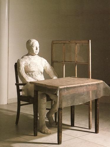
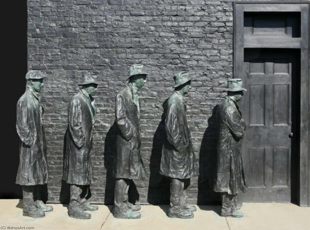
Personal Connection As I create my own sculpture, I can draw many parallels between Segal’s style and the piece I am making. Though I used an armature to create a frame as opposed to using a real person as a mold, I am still creating a figure utilizing plaster gauze. My piece retains a similar finish as Segal’s: a rough, crude texture in a solid, neutral tone. As I layer strips of gauze, allowing it to drape and clump around a figure, I imagine that George Segal once stood in his studio going through the very same process. Unlike Segal however, I plan to add materials on top of my base figure, so my finished piece will be busier and less austere. You will still be able to see the for underneath but it will be covered with scraps, partially obscured by other materials. More Information This video focuses on the sculpture Three Figures and Four Benches (1979) by George Segal (applies to question 1) https://www.icamiami.org/channel/george-segal-language-bodies/ You can learn the story behind Depression Bread Line here (supplements question 3) https://crystalbridges.org/blog/welcoming-george-segals-depression-bread-line/ Curious? You can see more examples of his work here https://mymodernmet.com/george-segals-mysterious/ Questions
5/29/19
I'm finished!! I just spray painted the whole thing white and I think it brought it all together. I still have a couple issues with the figure and the paint coat wasn't completely even, but overall i think it looks alright and I need to be done so I think this is it! 5/17/19 There was a bit of a gap in progress, but I have made some changes since the last post. I screwed in some loose screws that were being annoying so hopefully everything is secure now. I also added a bunch more wire and since I was out of the old wire, this wire is slightly different but its is only barely noticeable and the wire is evenly dispersed on the piece. I might add a bit more but the last big thing I want to do is paint it. I have not decided what color yet but I am pretty certain now that I will paint it. 5/1/19 I added wire around the figure and I feel like it works pretty well but its hard to see in the photograph. It still looks unresolved so I am probably going to add more screws and wires to create a denser web around her. I am nearly out of time so I'll have to work quickly. If I am still unsatisfied, then I might paint it in hopes of bring the sculpture together. 4/29/19 I covered the rest of the base with screws today. I would have liked to have more smooth variation in heights but working with two different screws and a thin base made it difficult to get a lot of different heights. currently, I am out of tall screws but I still have a bunch of short screws. I am considering adding more small screws on the base and possibly adding them on the figure too but I'm not really sure yet. Next Time, I will probably experiment will wire and decide from there if I need more screws. 4/26/19 I started putting on screws and I think i will need a couple more screws than I thought and I want to try and find more different sizes and maybe some shorter bolts and nails. For now I have decided to leave it white but I might paint the entire thing later. I plan on covering as much space as possible and I might also add wires over top of her. 4/24/19 I have finished putting plaster on my piece and I like the cohesion and how she blends into the ground. I am leaning towards painting her and if I do, it will be probably dark neutral colors. Progress is slow so I am hoping I can get a ton done next class and start adding wires and screws on as well since I am running out of time and my initial idea was to have a whole lot of stuff on top of the base figure. Overall, I am happy with how it looks right now and i hope I don't mess it up. 4/17/19 the dried plaster is very solid and I am happy with the rigidity and glad that nothing collapsed overnight. I finished plastering her, though I am not completely satisfied with the hand. I also began adding plaster around the base to create continuity. I am debating whether or not to paint the plaster and I also need to decide if I want another coat of the gauze to emphasize the drapes. 4/15/19 I have finally begun to add plaster gauze onto my piece. It is a bit lumpier and bumpier than I expected so either I will add another layer or embrace the bumpiness as texture. Right now she looks like she is wearing a body suit so next time I will finish completely plastering her. 4/12/19 With a short class period, not many changes were made. However, I did fix the arm and I think it looks a lot less like a noodle. I also began to more firmly secure her on the platform and add more mass to areas in the arms and legs that looked flimsy. 4/10/19 She is completely covered now, but i might make a few minor changes to the figure before I layer it with plaster. Overall, I'm pretty happy with the general form, but the arm is definitely too long and I am not sure how I will fix that. I also got a board to rest and attach the figure on, which I was excited about because now she is a lot easier and safer to carry. I am considering painting the plaster earthier tones once it is layered and dried so it isn't such a stark white. I will definitely play with that later when I start adding details. 3/27/19 I decided to change the leg and head position of the figure and luckily, since I am working with wire and newspaper, it was a simple fix. Though there isn't a lot of visible change, I made the stuffing denser and more secure, so she hopefully won't fall apart. I also added to the legs and started her arm. I still have yet to do the hands and feet so that will have to be next class. However, I have began to collect materials such as dead moss and screws for her later decorations. 2/25/19 Now, I am stuffing newspaper into the wire armature to fill the framework and using tape to mummify her so she stays in one piece. I am a little scared to do the hands and feet and I don't know how detailed I will be able to make them just yet. So far, the form is very crude but my plan is to layer her with plaster so she will have a more finished look before I add other objects on top of her. 3/20/19 Now that I have a solid idea, I have started to make the armature for my figure. Working with the wire was interesting and got be thinking in three dimensions. There are a couple small issues with the proportion, but overall I think it is a good place to begin. Choosing to depict a person will be a challenge for me but I have already passed the first hurdle. |
Hello Everyone!I am a Maggie Walker art student in Richmond, Virginia. This blog section is a little window into my art process, research, and experiences. You can follow along with my journey as you scroll. Archives
March 2020
Categories |

 RSS Feed
