Reflection
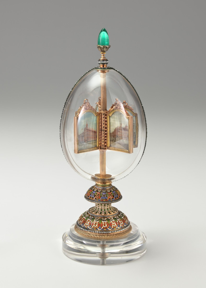
I remember walking into the Faberge exhibit in the VMFA and feeling like a magpie, attracted to all the glitter and shine in the intricately created details. There is an amazing level of craft and skill in each unique piece, and it was interesting to listen to the history behind these works of art during this lecture. Through the presentation, we could follow the paths of the Faberge eggs as they gained value and prestige. For example, one egg was originally given to Alexandra Feodorovna by Tsar Nicholas II which costed what would now be $130,5442. However, recently the third Imperial Easter Egg (above) was recently sold for about $33 million in what I found to be an almost movie-like scenario of a man buying the egg at a flea market. These pieces truly exude excess, and the company made everything from cane toppers to cigarette cases beautiful, so that you could be luxurious from head to toe. I often got lost in the winding trails that the eggs left as they traveled from one owner to the next with mark ups in between, but i think this elaborate path shows just how sought after these eggs are. Also, the idea that there are more eggs that are still missing leave a bit of mystery and an invitation for a treasure hunt with each story. From an aesthetic perspective, I appreciate how intricate the designs were and how carefully each one was planned out. They even all got their own individual box, which I think is adorable. There is also an interesting play of layering that is used in these pieces. While the outside of the egg is magnificent, there is additional treasure within, such as a miniature statue, portrait, or watch. I wonder: how much of the design was from the client's wishes and how much was the prerogative of the artist? Though my art is pretty different from the world of Faberge, what I take away from the lecture is the beauty of a carefully crafted piece and the interest and depth that can be created with different layers.
0 Comments
3/24/20
I sort of pushed through and got the rest of the piece done. I'm pretty happy with how it turned out. I decided to add two darker tones so that the shapes were more defined. It still looks a bit flat, but at this point I am not going to worry about it too much and think about how to fix it for the next piece. I also just love the color blue, so the cool blue hues in the piece make me very happy. I also love the amount of variation in corals though I am worried they all blur together. 3/20/20 I spent considerably longer than the time I initially gave myself but I got done a base layer of white. The outlines of the animals are a lot less obvious so you have to search a bit more to see them, which I like. I am thinking that maybe when I present it I will put some explanation and key with it so that people don’t completely miss the point of the piece. I was originally thinking that I might just use white, but I think it will help if I go in with some blues to create some more defined shadows and forms (though part of me does like the ethereal feeling it has now). 3/18/20 Did I procrastinate? Maybe a little bit. But I am starting now so I will have plenty of time during this Coronacation to get it done. I was hesitant to start because there are still some things I haven’t worked out yet, but at this point I just needed to put pencil to paper and hope my worries get sorted out as I go along. I started with just drawing lightly in pencil which I will erase later so that I could make sure I got the entire composition to fit. I think it looks alright at the moment, Next time I will replace what I have with the white. 3/16/20 I decided I still wasn’t ready to start the actual piece so instead I did some more searching around to find some different cool corals to include in my piece. I tried to include a lot of different shapes so that there would be a nice variety and they would be able to fit the shapes of the hidden animals. 2/12/20 Though I do have some preliminary sketches, I am still very uncertain as to how I want to approach my at home project idea. I am planning on creating a ocean scene in which you can see the silhouettes of sea creatures in the negative space. However, none of the sketches so far are speaking to me. I am fairly sure that I want to draw this one since I have a large toned canvas that I want to use, and I have not done a long term drawing since the first at home project. 3/9/20
It's all done! I think the background really helped to tie the piece together and help with the flow and composition. The seaweed itself is a bit clunky but I think I will just have to call that a learning experience and fix it for my next piece which will probably also have some seaweed. Overall, i am pretty happy with how the piece turned out and I am proud that despite it being larger than my other pieces that the project didn't drag out for too long. I love the color combination and texture that I used. 2/25/20 Okay, I think I am going to actually step away from the seahorse now and do the background next. I am getting to this a lot later than I anticipated but I guess I’ll just have to keep moving forward. This week, I had a bunch of other tasks for YAMM that had to get situated so some of my painting time got cut short. I am happy with the way that the fin turns out, and how the lighter blue gives the illusion of a translucent film. I think for the background, the seaweed will be a blue-green to match the undertones in the water, and hopefully that will add depth and dimension 2/19/20 I definitely feel myself slowing down the pace a bit. Maybe it's because I was feeling a bit more uncertain about the tail part of the seahorse because I had to alter it from what the reference for the head looked like. At this point, I like the way the animal itself is coming together, but I don’t think it clicks as a piece as a whole yet. Maybe I will end up painting in the belly, but I feel like that gets rid of my original concept. I am going to do the background before I make that kind of decision though. 2/12/20 I added a bit more to the background, which you can't really tell. The most obvious thing is that I began painting the seahorse. It is a very, very vibrant coral color which I think complements the ocean well but i hope that the white and more muted detailing will subdue it a little bit. Also i spent a while considering how I want to add in the seaweed, but that will come later. 2/10/10 I decided to keep the composition as it was and began painting the background today. I actually got farther than I thought I would and so now all of the background is at least covered in some paint. I do think I will add some more texture though. This is different from previous paintings where I start with the subject, but then getting in the crevices is always difficult so I hope this makes the process easier for me later 2/6/20 I spent some more time thinking today, but eventually I did settle on something. Originally I had decided to revert back to my three canvas plan, but in the last couple minutes of class, i decided it might be interesting to add two more canvases. I am still unsure about the current composition so I might rotate or adjust before I begin painting. 2/4/20 I am currently still brainstorming ideas for this project at the moment but hopefully by the end of the week I will have at least completed a rough sketch of what I want to do. I want to scale up a little bit this time so that it fills the space a bit better, but I am worried that I will loose the refinement that my smaller pieces sort of have. I am leaning towards making the subject of this one a seahorse, since I think it would be interesting to contort and also play with flowing seaweed surrounding it. |
Hello Everyone!I am a Maggie Walker art student in Richmond, Virginia. This blog section is a little window into my art process, research, and experiences. You can follow along with my journey as you scroll. Archives
March 2020
Categories |
 RSS Feed
